Course Playbooks
Course Playbooks are a comprehensive overview of what is in a course, a list of Course Instructors, and version release updates. Playbooks are faculty facing to help guide Course Instructors and Program Mentors through student phone calls for term planning and course strategy.
The Team
To execute this project for stakeholders we had a Project Manager, SharePoint Engineers, myself, and a group of users this project directly impacts.
Our Goals
Consistent navigation which will eventually roll out to all five colleges. Currently only a handful of courses have playbooks and they are housed in different platforms.
Migrate 11 playbooks into SharePoint and create a template that would function as the standard look for all playbooks in the university (will be over 400 throughout the five colleges).
A place to document and implement feedback from users throughout the rollout
Research
Stakeholders and faculty had great insight at the start of the project but I still had questions. How many employees know about playbooks? What does faculty need within a playbook? What would make their lives easier?
At the end of the day we needed to hear from faculty this would impact most. A survey was created by the team and distributed to over 1200 Program Mentors, Course Instructors, Evaluators, and Faculty Management.
Looking at the responses to the question: “What additional info/features would you want in a Course Playbook?” I found that there were three themes that kept popping up:
Pacing - Information on how to guide a student through a course based off of how quickly they want to complete it (accelerated, standard, or steady).
Resources - Anything from tips from students or faculty to what is needed to begin the course.
Architecture - Primarily focused on consistency in navigation and content.
Another data point that helped with further understanding the needs of faculty was seeing how useful features currently being used were. I took the data and highlighted sections that were used “often” and “sometimes” to determine hierarchy and what needed to be easiest to access.
Wireframes
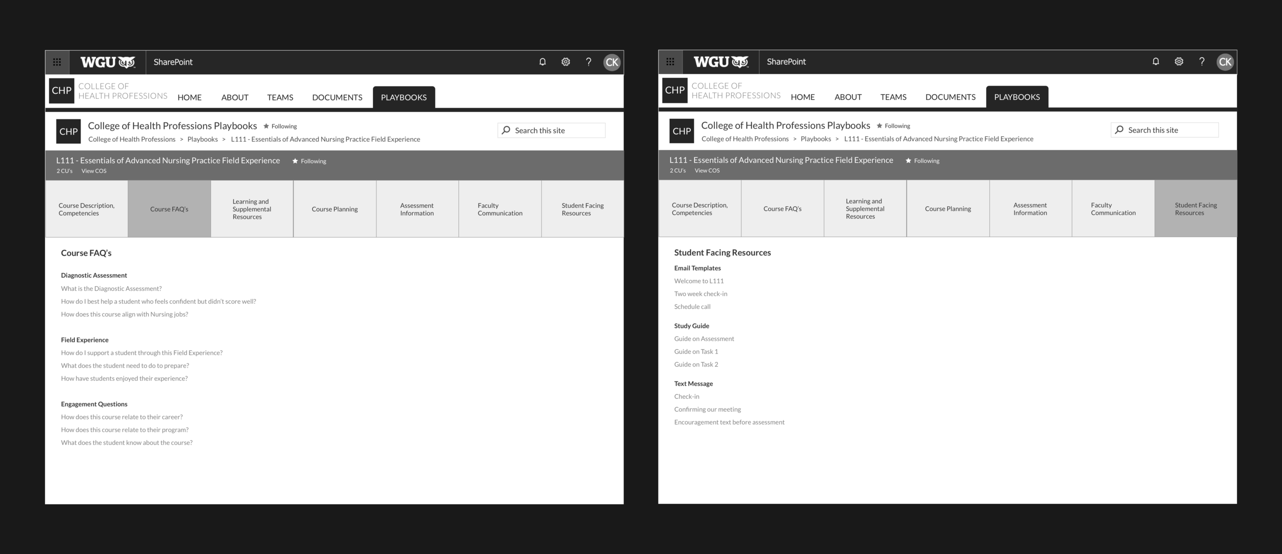
Two of the wireframes showing navigation and potential content.
User Discussions
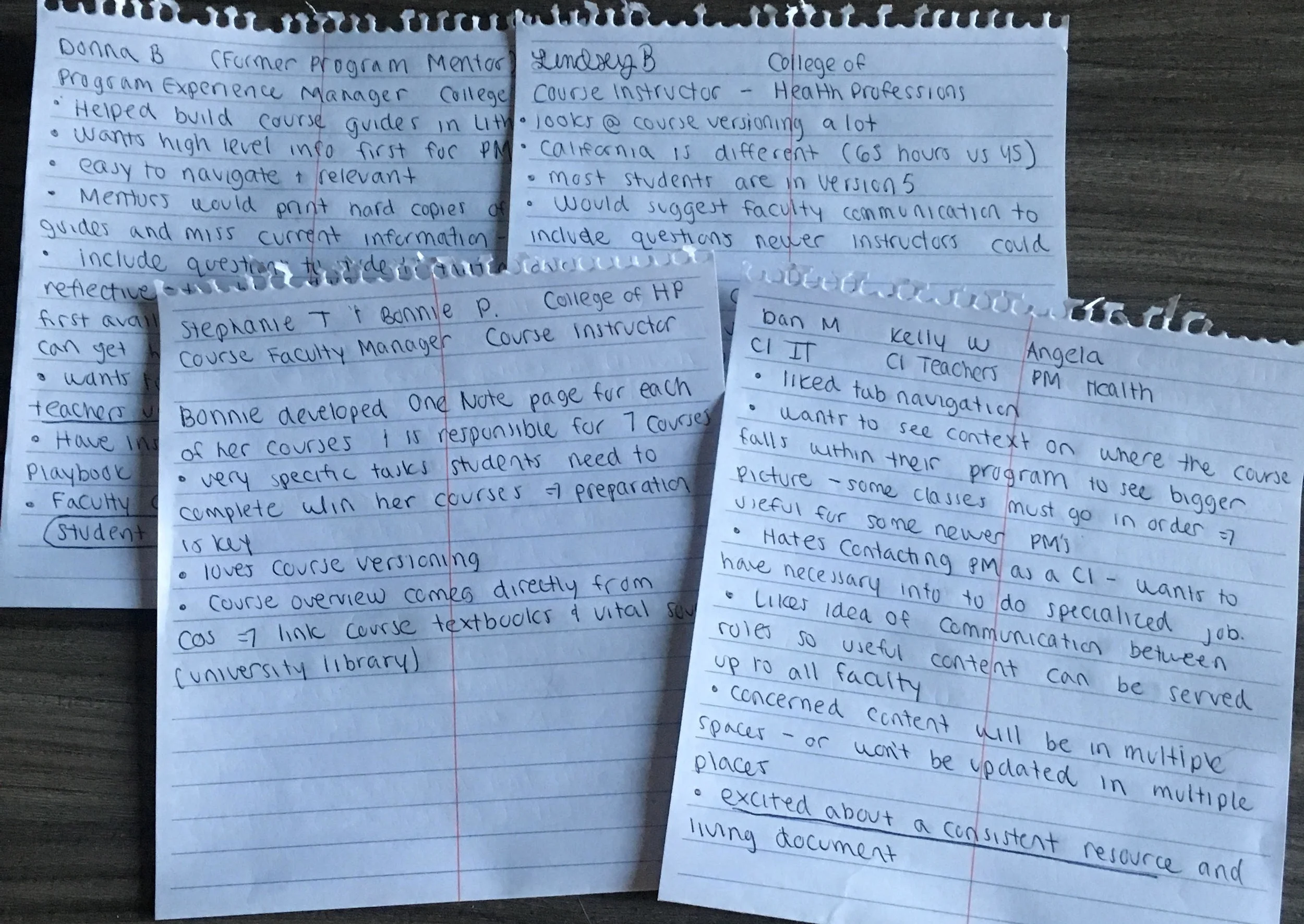
I set up several 30 minute online sessions with 12 Faculty Management, Program Mentors, and Course Instructors. We discussed the wireframes navigation, terminology, and how a playbook would benefit their jobs. Gaining feedback from faculty was invaluable. My goal revolved around user insight and ensuring what needed to be presented to them was easy to find and consistent between playbooks.
Navigation / Terminology
During discussions with faculty I found that some of the terminology I was testing was a bit confusing - mainly “Student Facing Resources”. People were unsure if this meant that students would have access to these playbooks. This was changed to “Student Communication Tools” when changed our stakeholders and remaining faculty loved.
When I met with our Project Manager and Lead Engineer we talked about “Course Planning” vs. “Term Planning”. The thought for this would be separate experiences for Course Instructors (Course Planning) and Program Mentors (Term Planning) as they have different goals with the students. With the first rollout we decided to do “Planning” as the tab to make it easier for our developers deadline.
Design changes after Feedback
Learnings
This project had a quick turn around for research, understanding stakeholder goals, and coding. That being said we needed to back to meet our deadline for the first release.
Stepping Back from UI - By the time approval and the engineering build was beginning we had to let go of the tile size, active/inactive colors for navigation, our approved brand font, and the colored banner defining the course name.
Consistent check-ins with Engineers and Stakeholders - this is pivotal to any project but more so when you have quite a few teammates that are remote. A project with this many moving parts and intentions requires a clear understanding from not only the stakeholders, but those that will build out the product. As a designer being a translator to both the business and the development required flexibility along with asking the right types of questions.
What would next steps be?
User testing, collecting feedback from faculty once the sites are live.
Further iterations based upon feedback and results of the user test.


